
- Home/
- ZAG universe/
-
Innovative Design
Innovative Design
![]()
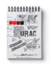
SAINT-LAZARE, creator process
"Be-poles (now Saint-Lazare) was born at the beginning of the 2000's and developed in Paris and New York with the aim of : Building strong and long-lasting brands, based on strong basis and not on passing fads. We often introduce ourselves as a designs studio rather than as an agency. Creation, guided by our intuition, is at the core of our approach.
We always wanted to think about the brand not as a logo but as stories to live and memories to create. Our job consists of understanding and telling a brand's story with sensitivity, intelligence and experience to allow it to be understood. To conclude, our narrative approach will serve their brand's speech.
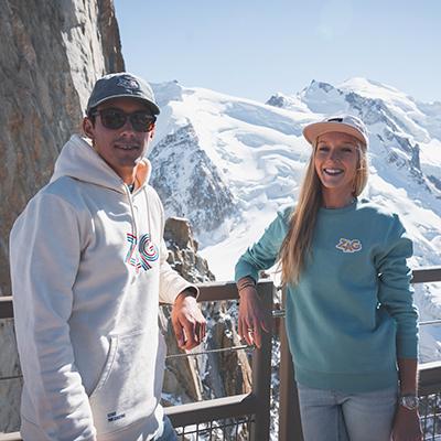
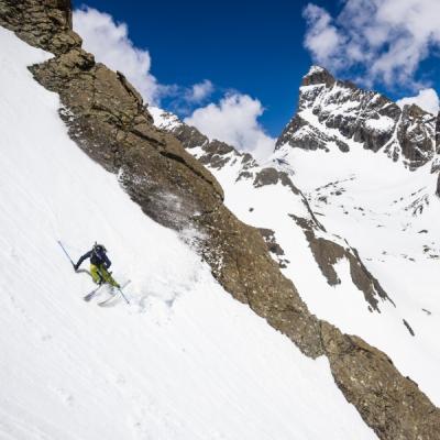
Meeting ZAG was the perfect opportunity to combine this approach with the brands and our enthusiasm for mountain. Antoine Ricardou, co-founder of the Studio with Clémentine Larroumet has fasteners is La Clusaz in the Aravis (Alps). Every winter he roams the mountaintops and alpine tracks on his UBAC. This confrontation with ZAG's reality reinforces each year his graphic proposal for the lines he's constantly renewing."
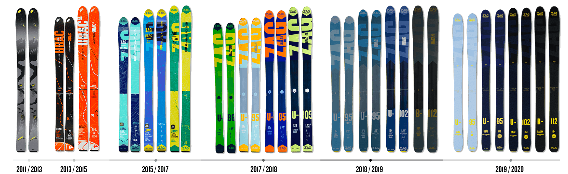
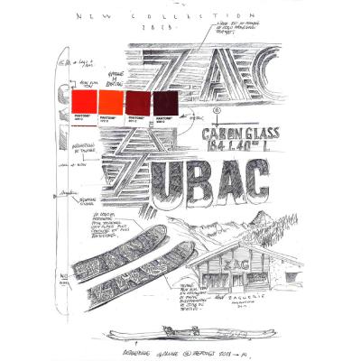
2013 - The Origin
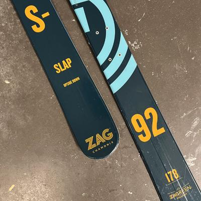
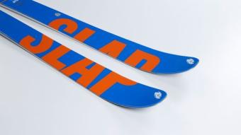
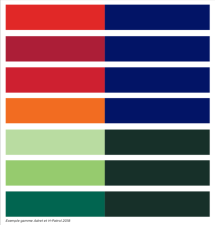
Blue and Orange SLAP
The main idea of the first works on ZAG was to give a strong identity to a brand everyone cheered technically but was graphically invisible. We wanted to strike hard and put the SLAP line first (Style Libre Arrière Pays, literally translated from the English Freestyle Backcountry) ad it was the one carrying the ZAG project at that time. This graphic signature straddling both fronts of the skis has become timeless and we have kept it until today. It also is the starting point of the meeting between ZAG and the colour, that won't leave the brand anymore. ZAG has become this joyful and colourful spot on the spotless snow.
2015
That year we re-organized the lines in a much clearer way, isolating one colour per product range and creating a colour gradient depending on the width of the skis. Graphically the SLAPS had become the S. Under the drive of the H-112, the line H had created itself. The Ubac line grew wider and had become U. The Adrets separating from Ubac had become A.
2018
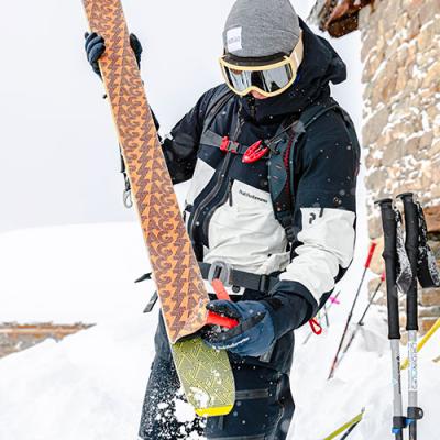
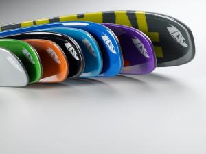
The ZAG frame (that we could see on climbing skis at that time) is growing. It lightly appears on the colour marks of the skis, creating reliefs. Monochrome is reinforced and the designs such as shapes are simplified to testify the line's universality. Studio Be-pole has worked on a chromatic line inspired by Bahaus and Joseph Albers. Skis are becoming monochrome to radiate even more on the snow. A ZAG ski is not to be looked at in a shop but in its natural element. That's where it show its full worth. Happy ride. Happy colour ride.
2020
Since ZAG's creation, colour has always had a major meaning within its identity. Contrasts go in duotone or tone on tone. Using colours in stark contrast with the snow's white such as fluorescent or metallic colours is the baseline of the brand. Following these rules, the colours are evolving from seasons to seasons.